Designing a Disposable Health Device Interface in a Pandemic: Fast UX for Fast Manufacturing
Client: BMR Medical Role: Lead UX Designer – Visual Design, Research, A/B Testing, Design System
Making simplicity functional—under pressure.
BMR Medical needed a simple, disposable, low-cost LCD health device. My role was to design the visual interface—creating something intuitive, readable, and easy for medical staff to use. But mid-production, a few problems surfaced, compounded by pandemic constraints.
The Challenge
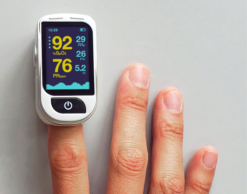
Contrast and readability were flagged by medical staff, who found the screen difficult to read quickly in clinical environments.
The device didn’t have adjustable color contrast, meaning it couldn’t adapt to different user needs or lighting conditions.
Data clarity was poor—vitals were hard to interpret at a glance, which could slow down decision-making in critical situations.
We had no in-person testing due to the pandemic, making it harder to get direct feedback on the interface.
How we pulled it off
Guerrilla research, remote-style
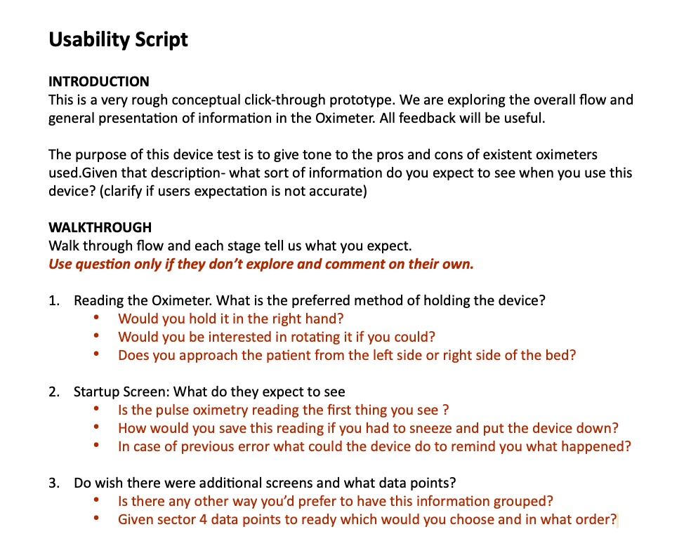
With no research budget and limited in-person access, we used paper prototypes and webcam interviews to gather direct feedback from medical staff. I crafted a usability script to focus specifically on contrast, readability, and data clarity in the interface.
Webcam doodles + fast iteration
I sketched interface variations on paper, holding them up to the camera for feedback from hospital staff and biomedical engineers. This was our way of quickly iterating and testing the interface despite the restrictions.
From chaos to system
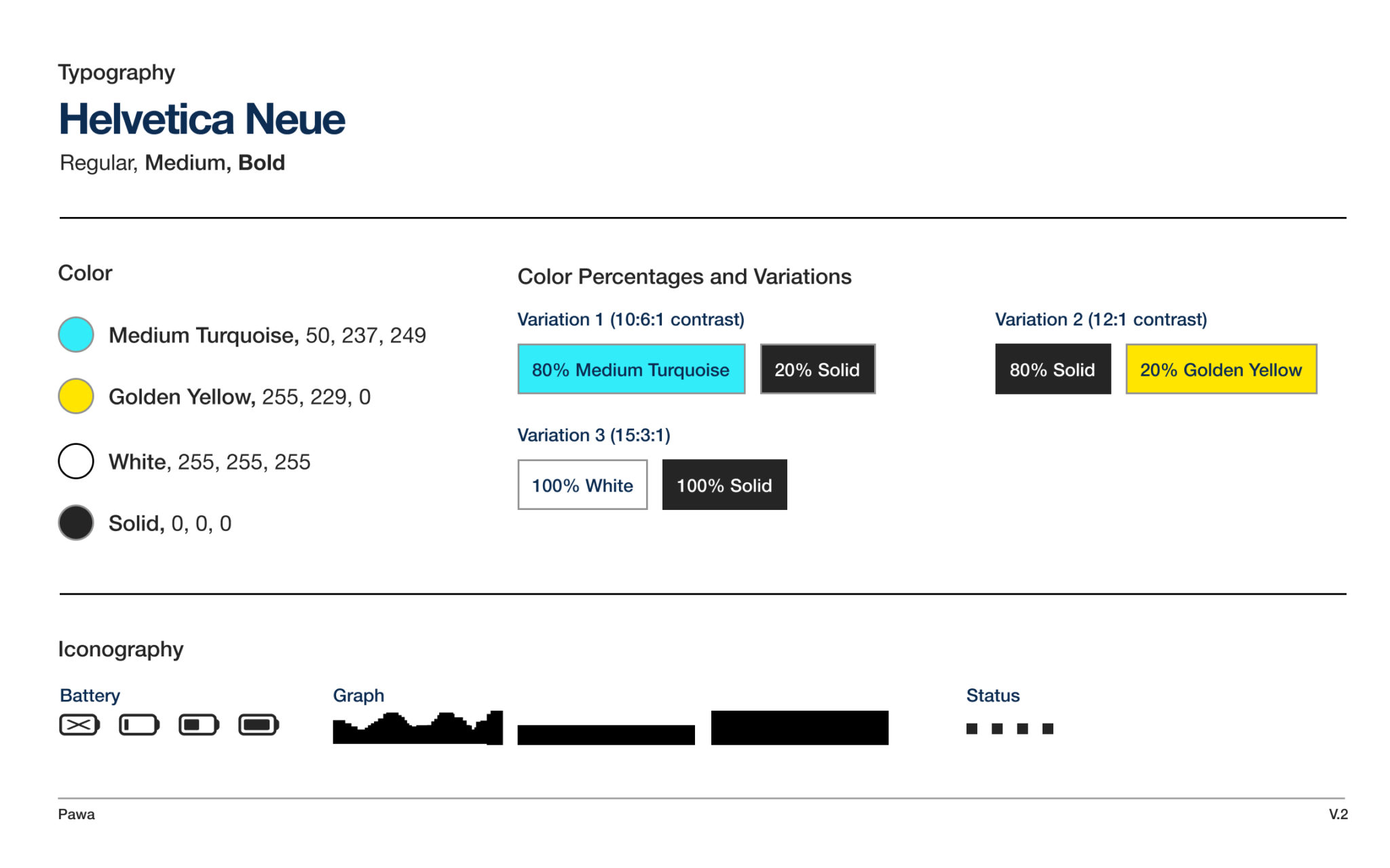
As the screen specs changed mid-production, I documented the evolving design decisions—focusing on typography, contrast ratios, and layout—in a design system to ensure a smooth handoff to manufacturing teams.
Increased contrast between text and background for better readability in clinical environments
Larger fonts and adjusted layout to make data easier to read at a glance
Simplified iconography and clearer data grouping to reduce cognitive load
Created a design system for the interface to support future iterations and ensure consistency across manufacturing
Though our initial focus was on concept and research, we decided to advance by prioritizing delivery and adapting the science system to suit industrial manufacturing needs. This approach ensures error-free, seamless delivery and fosters collaboration for the upcoming project team.
Research
Ad-Hoc and Guerrilla Research Strategies
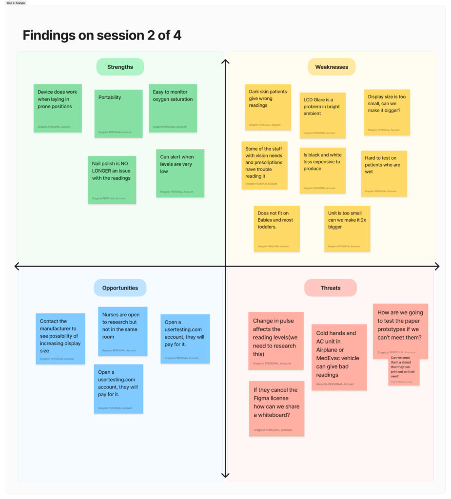
Doctors found the beta oximeter too small, leading to a redesign focused on battery life, screen size, and contrast. With no research budget, we got creative by reaching out to nurse stations for insights, which became the foundation for our design adjustments. We then conducted paper prototype sessions to test readability and developed a usability questionnaire, covering key phases from introductions to task completion and follow-up.
Create a Usability Script for the Remote Interviews
Creating a usability script questionnaire was crucial for capturing the unique needs of users with disabilities in our research. Simple as it was, it allowed allowed us to gather structured feedback, ensuring inclusivity and guiding conversations during remote sessions.
Why we needed it?
- Inclusivity: To understand the specific challenges faced by users with disabilities.
- Structured Feedback: To cover all relevant topics and facilitate open dialogue.
- Identifying Barriers: To pinpoint usability issues and inform design improvements.
What I Learned
User-Centered Adjustments: We redesigned based on critical feedback—like increasing screen size and improving contrast for better readability, which was a game-changer for doctors.
Remote Success: Remote prototyping worked surprisingly well, with paper stencils and sizing charts used for real-world testing, leading to design improvements grounded in user feedback.
Smooth Manufacturing Transition: Despite tech setbacks, the project was handed off with a clear, well-documented design system, setting up future teams for success.
Outcome
Despite the challenges, we delivered an interface that addressed the medical staff’s key concerns: clarity, contrast, and readability. Even with limited resources and a remote-first collaboration, the project successfully improved the user experience of the device, preparing it for future production and refinement.