Nucleo Design System
Role: Design System Lead, Design Handoff
Client: Subaru Internal Wellness Tool Design System
Tools: Figma, Storybook, and Token Studio
Duration: 5 weeks
Overview
Background
The Subaru Internal Wellness Portal provides visuals and tone guidance for car salesmen and HR representatives. It operates regionally, with eight dealerships being the first to implement it in their system.
My Tasks
My tasks included converting the Sketch components to Figma, applying a hierarchical token structure, implementing everything in Storybook, and demoing it to the developers. Along the way, I also focused on:
- Convert Sketch components to Figma and use Token Studio to manage them.
- Apply hierarchical token structure.
- Redesign components for WCAG 2.1 compliance.
- Apply 8pt grid spacing to all components and create a responsive column structure.
- Create a scalable design system for different breakpoints..
- Implement components in Storybook.
- Demo to developers.
The Problem
The system lacked a token-based structure, which caused inconsistencies in design and development. I was tasked with converting it to a token-based system to improve scalability, reusability witting the Figma components, and ensure a consistent user experience. This transition was necessary to streamline development, enhance accessibility, and maintain uniformity across the platform.
Challenges
“Surprise! You’ve Got 5 Weeks—And Last Week Was the First!”
The current components didn’t have a consistent design guide that aligned with the brand, which led to several iterations of the same component without uniformity in implementation.
Additionally, some side tables and forms were hard to use due to insufficient testing, causing them to fall short of many accessibility guidelines. While the project roadmap initially suggested we could complete the work in six weeks, it became clear that we faced some challenges in creating a cohesive and accessible design.
The Design Process
Initial Steps: Enhancing the Existent Color Palette with Tokens
I kicked things off by refining the color palette for the project, choosing a cohesive set of 6-10 colors for consistent use across all components. Each color was assigned a specific role, like gray 400 for input field borders and gray 300 for dividers. This not only simplified design decisions but also added a nice visual harmony to the project!

Accessibility First: Creating Digital Spaces for All
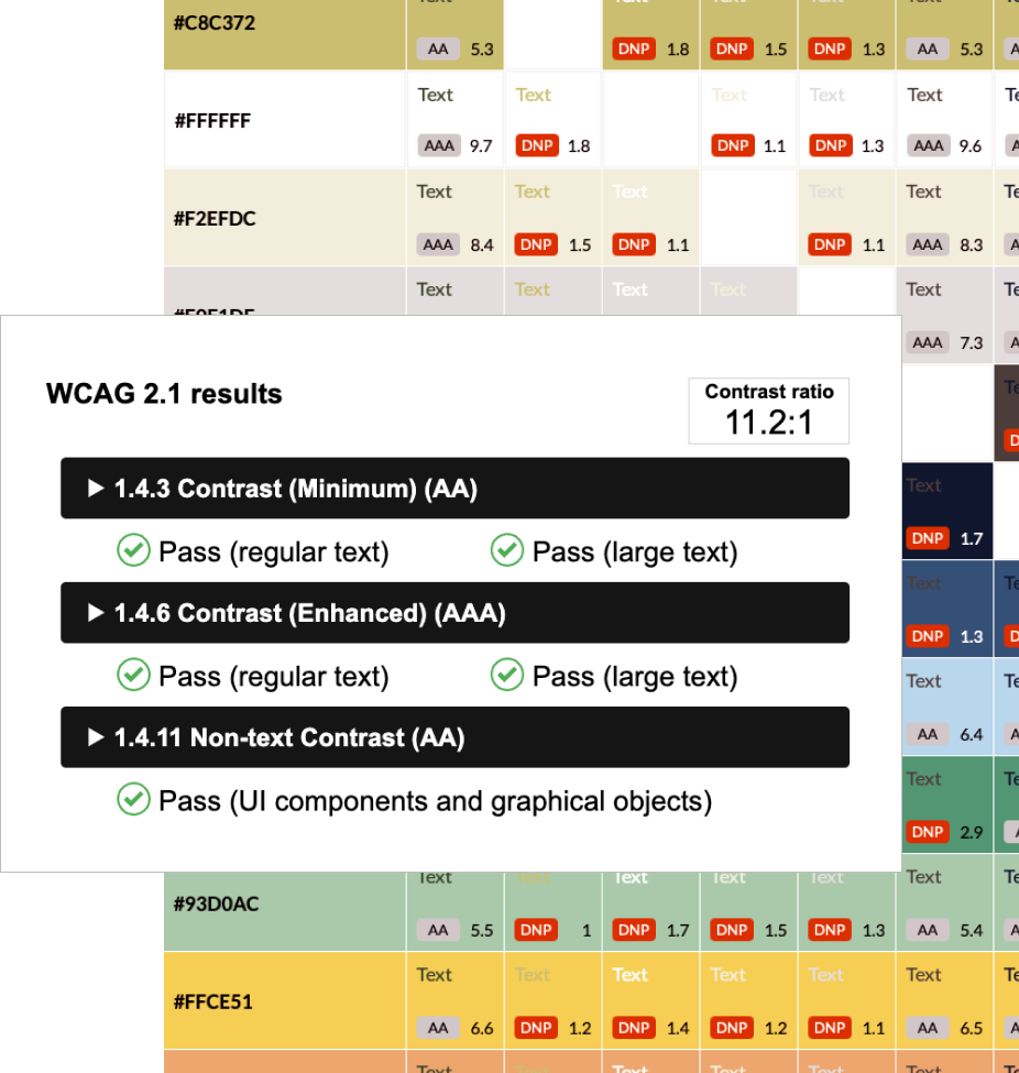
To ensure our UX design system was accessible, we collaborated closely with developers to integrate WCAG 2.1guidelines focused on color contrast, font sizes, and navigation. This partnership allowed us to make real-time adjustments based on feedback.
We conducted usability testing with diverse user groups and used Storybook to create a robust library of accessible components. Tools like axe and Lighthouse helped us identify and resolve potential issues before deployment, ensuring a seamless implementation.
- Color Contrast Testing
- Functionality Testing
- Pragmatic Testing
- Screen Reader Compatibility
- Responsive Design Testing

Building Blocks of Design Tokens in Figma
- Most, if not all, components needed to be created with a specific set of variables to eliminate guesswork for future team users.
- The use of variables would simplify design processes and act as a clear source of truth for the design system.
- These guidelines ensured consistency and reduced ambiguity.
- Designers and developers could implement components confidently while maintaining visual integrity and functionality.

NDA Approved Design Screens
The design screens included all available components with clear labeling to help make the transition to Storybook smoother for the developers.

Testing
Crafting Collaboration: Enhancing Design with Storybook and Developer Handoffs
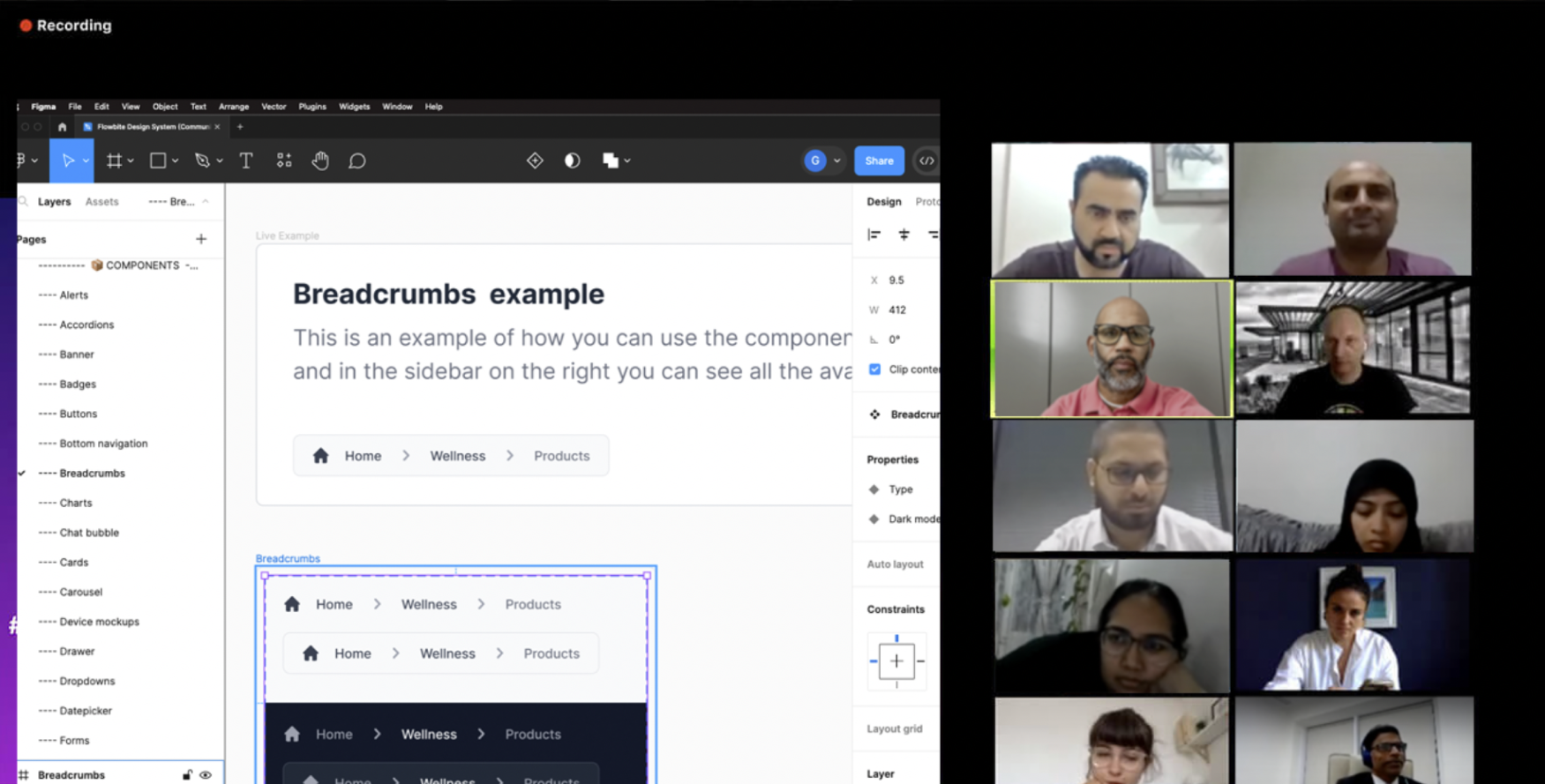
I organized fun design show-and-tell meetings with junior designers and developers, which helped create a supportive mentorship vibe within our fully remote team. This approach not only ensured consistency but also sped up development, fostering a collaborative environment that encouraged iterative improvements in our work culture.
I’m thrilled to share that the launch of the design system resulted in a 17% improvement in the delivery of new screens for the business! The team was eager to elevate the design system and its components with Storybook, thanks to the comprehensive documentation and guidance we provided

Outcome
- Design Tokens, Design Tokens, Design Tokens: Establishing a robust set of design tokens upfront significantly reduced discrepancies and improved communication about styles.
- Collaboration is Key: Regular check-ins and collaborative workshops helped bridge the gap between design and development, fostering a sense of shared ownership.
- Embrace New Tools: While Storybook was initially intimidating, its benefits in visualizing components and promoting reusability were undeniable. Our team learned that adopting new tools can lead to greater efficiency and creativity.
