Efficient, Cost-Effective Drug Management Made Simple
Role: Lead UX Designer in a team of 4
Client: Prime Therapeutics (Now Magellan RX)
Tools: Figma, FigJam, Notion, Airtable, UserTesting.
Duration: Spring 2024
Overview
Background
My Assigned Tasks
- Redesign the homepage based on feedback by producing sketches, wireframes, and final designs that emphasize responsiveness and accessibility.
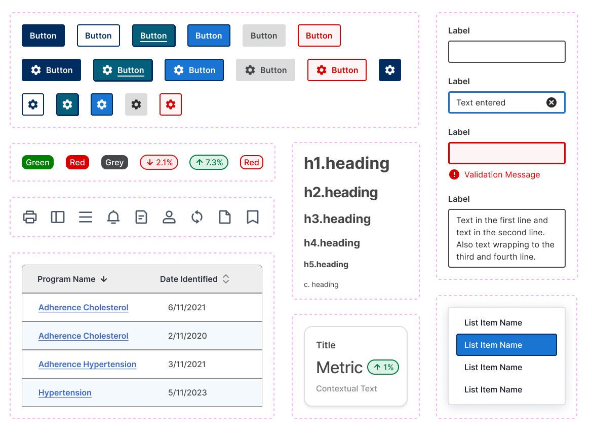
- Create a comprehensive token-based design system to maintain consistency.
- Carry out a third round of usability testing on the redesigned homepage to evaluate its effectiveness.
- Iterate on the designs in Q4 based on testing results and user feedback.
The Problem
The absence of a design system caused inconsistencies in the interface and design patterns, leading to confusion.
The design lacked responsiveness and mobile optimization, limiting usability across devices.
Key features were hard to locate and not intuitive, causing frustration and inefficiency.
My Project Deliverables
Conduct research and user interviews to gather insights and create user personas.
Develop wireframes aligned with user needs and project specs for stakeholder presentation.
Convert wireframes into high-fidelity designs, incorporating feedback and ensuring accessibility standards.
Create design systems to maintain consistency across the project.
Finalize high-fidelity mockups and deliver to Dev for implementation.
Document design decisions for future reference.
Research
User Interviews
Working closely with a great project owner, we interviewed users to uncover pain points and explore a more modular UI. Together, we shared these insights with the front-end team and developers.
Discovery
Learning is a non-linear journey. Throughout the project, I aligned with the client’s business goals by conducting stakeholder interviews and performing market and competitive research to identify evolving needs and gaps. My research process included:
- Establish objectives and create a plan.
- Identify hypotheses and assumptions.
- Choose methods to address knowledge gaps.
- Conduct research and collect data.
- Analyze and synthesize the findings.

In developing the product strategy, I crafted an empathy map to uncover user needs and frustrations, which helped shape the site’s information architecture. Leveraging research insights, I identified key features for the MVP, prioritizing them through an impact vs. effort analysis. This foundational work set the stage for future wireframing and content strategy.
Design Process
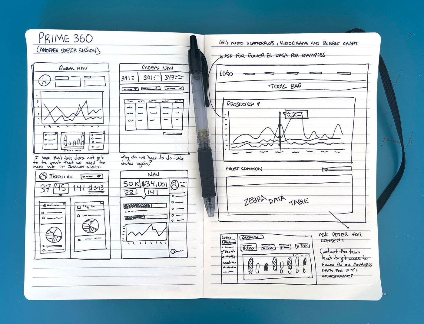
Sketching…a significant amount of it.
Sketching played a key role in the ideation process by quickly clarifying ideas and facilitating brainstorming. It helped align stakeholders early on, enabling faster decision-making and collaboration. This approach ensured a clear and unified direction for the project from the very beginning.

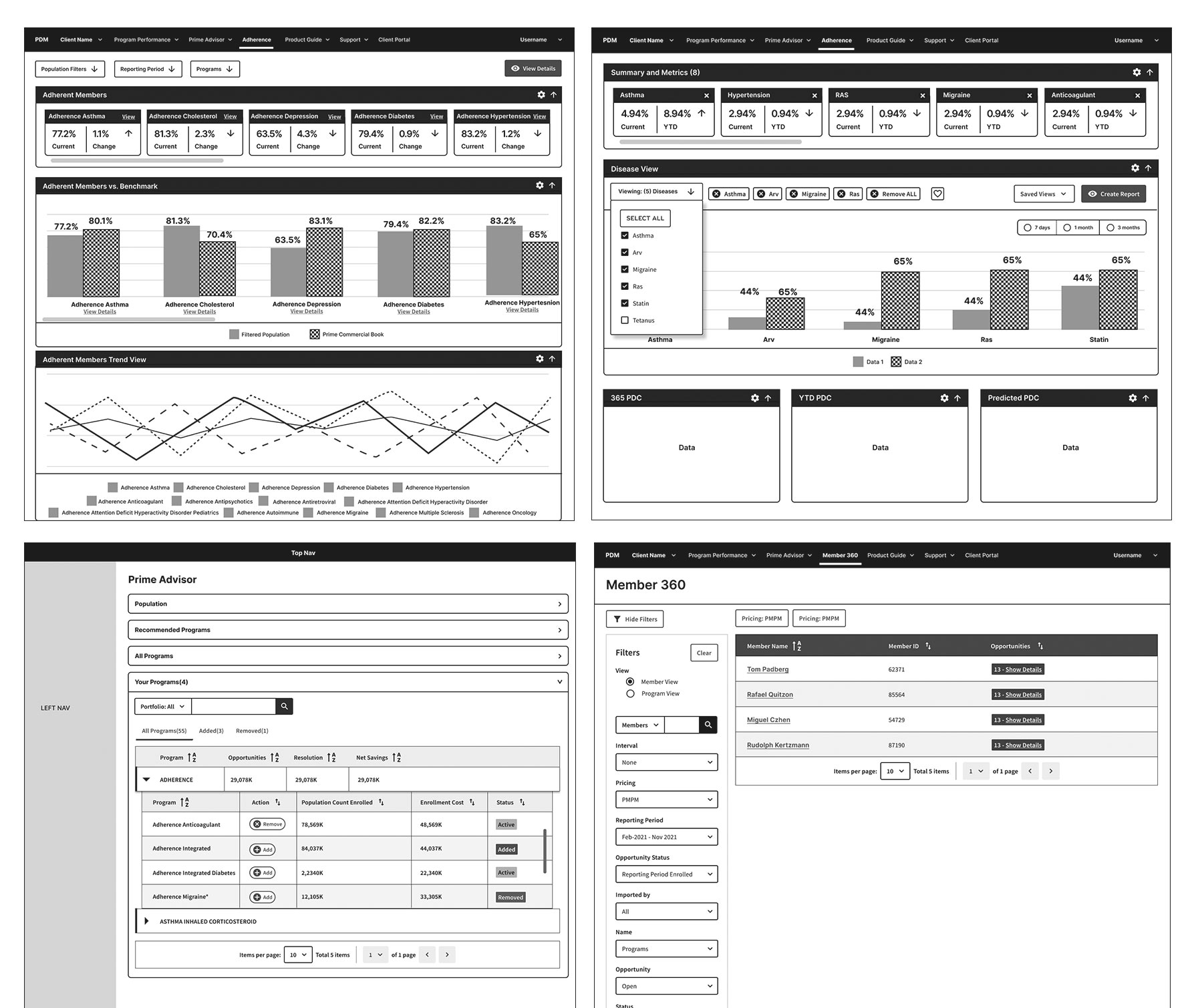
Wireframing and A/B testing sessions
I led remote A/B testing and wireframing sessions, creating low-fidelity prototypes to refine user flows and analyzing results to identify the best design solutions. My leadership ensured alignment, collaboration, and a user-centered, optimized experience.

Sample Prototype
Due to an NDA agreement, I am only able to share a previous version of the approved product.
Sample dashboard screen featuring a modal for adding prescriptions and insurance providers.
Design System

Outcome
During the redesign of the homepage dashboard, I realized that more data doesn’t always mean better usability. The original design overwhelmed users with dense tables, leading to confusion and frustration.
Key Takeaways:
- Simplify Data Presentation: Shifting from heavy tables to clean visualizations made insights easier to understand at a glance.
- Use of Dynamic Widgets: Incorporating widgets with real-time data improved interaction and reduced clutter, enhancing the overall experience.
