Redesigning a Pharmacy Benefit Managerfor Specialty Drug Solutions
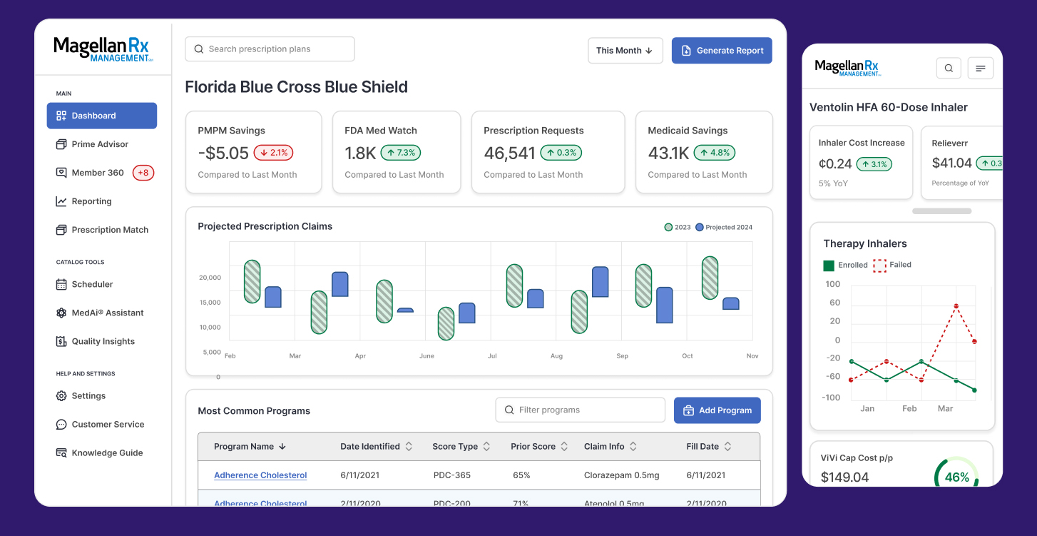
Role:Lead UX Designer| Client: Prime Therapeutics(Magellan RX) | Duration: 14 months | Team: UX, Research, Accessibility
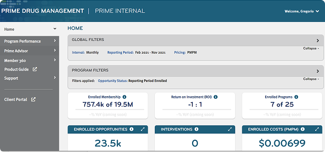
Problem
The platform supporting specialty drug access was held together with duct tape—no UX standards, poor accessibility, and no design system in sight. Nearly 70% of users struggled to navigate the interface. That meant delays in managing medication access for members, employers, and government agencies—when speed matters most.
Solution
I led the redesign from the ground up, building clarity, consistency, and structure into a system that had none.
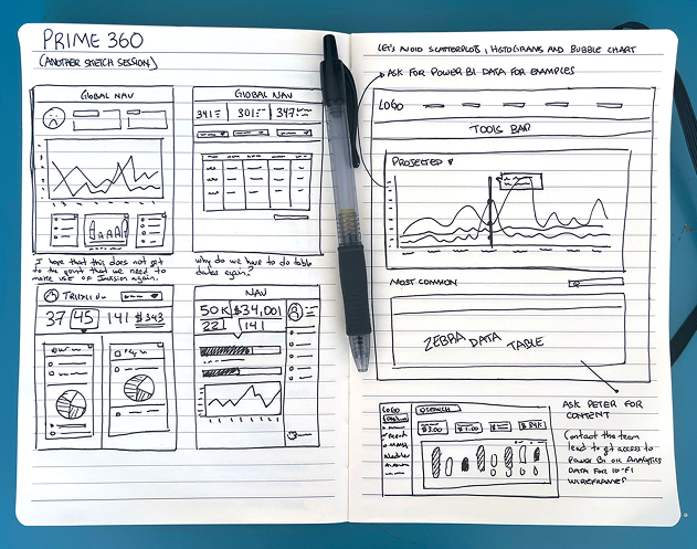
1. Quick wins with the sketchpad
Sketching helped align everyone early. It got ideas out of heads and into conversation, fast. This early collaboration cleared up misalignment before pixels ever hit a screen.
2. Wireframing and A/B testing sessions
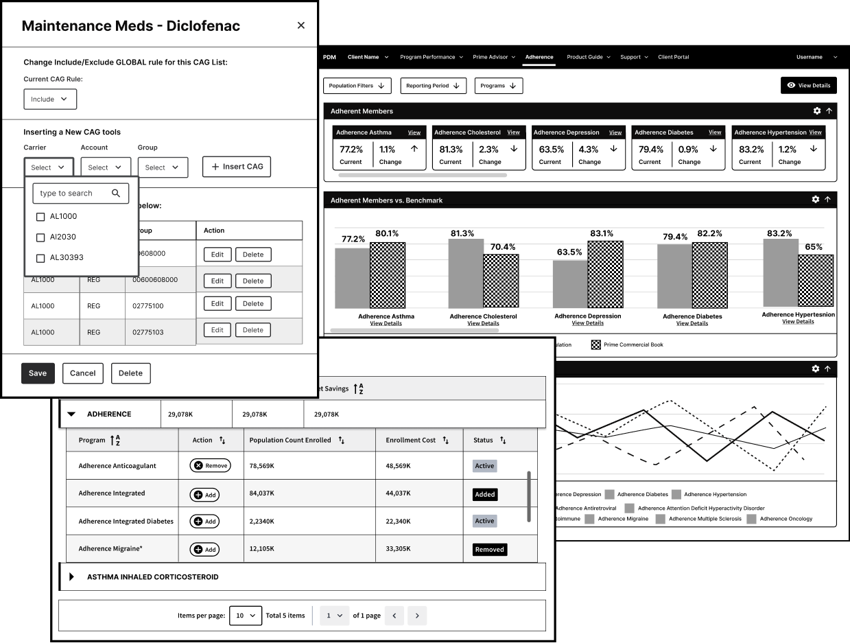
Using wireframes and low-fidelity prototypes, I ran A/B testing sessions focused on the biggest pain points from our gap analysis. These iterative tests helped us simplify navigation and streamline tasks, backed by real data.
3. Scalable Design System
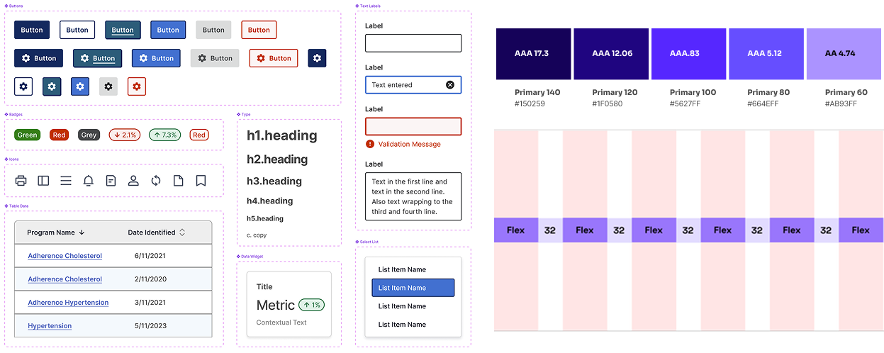
I established the foundation for their first design system—refining the typography scale, building an accessible color system, and applying atomic design principles. After auditing the component library, I cut the bloat from 64 disjointed elements down to 23 streamlined, reusable ones. That meant faster builds, better usability, and a system that could scale without falling apart.
Figma Prototypes
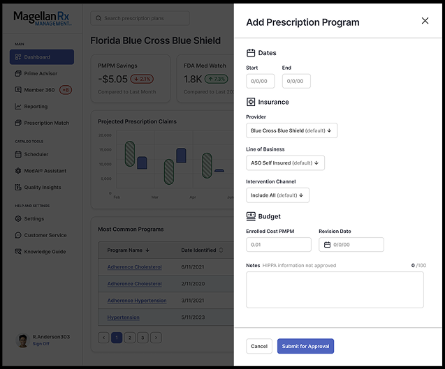
I have two complete process prototypes available, which I can share in the full use case study under NDA. Feel free to reach out if you’d like to see them!
Lessons Learned
Design systems aren’t just a style kit—they’re a tool for scaling decision-making. Starting small, testing fast, and building in reusability early paid off. And sometimes the biggest gains come from aligning teams, not just screens.
Outcome & Results
This project reinforced the importance of early collaboration between design and development, highlighted the impact of scalable design systems, and demonstrated how prioritizing accessibility and user feedback can significantly improve usability and efficiency. These efforts led to measurable outcomes:
- 30% faster completion of key workflows, including the Find Prescription Savings tool, by redesigning complex flows with simplified data tables and advanced filters
-
Usability scores rose 22% and NPS improved by 18 points after streamlining navigation and introducing a more intuitive reporting experience
-
Reduced design/dev time by 40% by giving developers and designers a scalable component library to iterate and ship new features faster
-
Design system adopted by 3 additional company-wide projects, establishing a unified experience across the ecosystem and reducing duplicated effort
Full use case available upon request.
