Role: UX Design Lead & Researcher I Client: Haitian Red Cross + Haitian Chamber of Commerce
The Problem
Haiti’s disaster relief efforts struggled to mobilize vetted volunteers due to safety concerns and lack of coordination. The solution: a mobile app powered by a WordPress backend, using a crowdfunding plugin to quickly feed data into the app. This approach aimed to bypass Apple Store restrictions and speed up development.
My Role
I led UX research and design, translating messy requirements into actionable strategy. Collaborated across remote teams to align PMs, devs, and stakeholders. My work spanned:
Research planning & field studies
Persona creation & journey mapping
Design, Prototyping & usability testing
Development handoff & sprint support
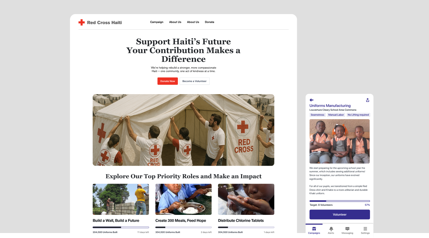
Low-Fidelity Design Prototype
What We Built
A mobile experience focused on volunteer vetting, curfew coordination, and real-time local support—all powered by a lightweight backend.
Research & Insights
We kicked off with ethnographic interviews and market analysis. I crafted personas representing tourists, diaspora volunteers, and local coordinators. Their pain points helped shape the core flows around safety, trust, and transparency.
Rapid Iteration
I led remote workshops via Figma and Google Meet, sketching and wireframing ideas live with the team. Subject matter experts provided constant feedback, leading to fast pivots and sharper design decisions.
Design Handoff
To keep dev moving, I documented interaction patterns and flagged UX debt early. Working closely with the PM, we trimmed the story backlog and increased delivery velocity by 14%. Notion became our single source of truth.
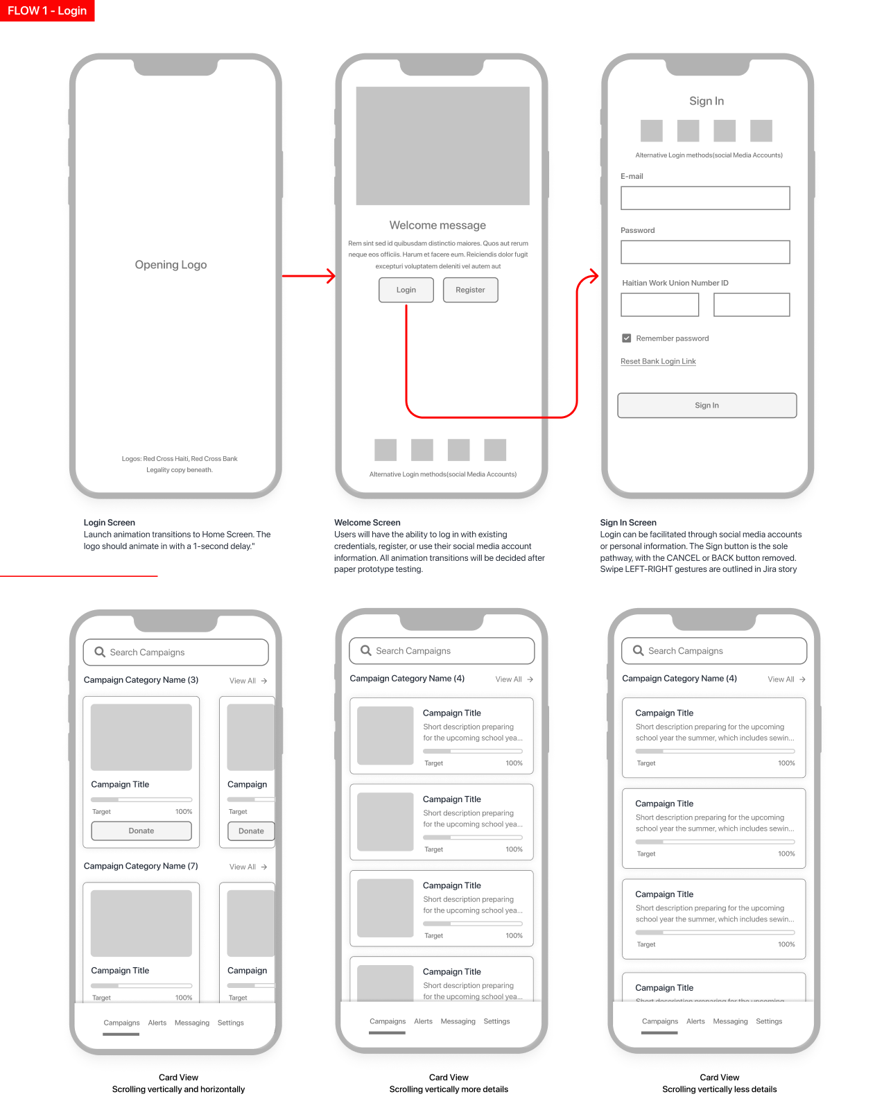
Userflows
I conducted three research studies, including creating the journey map and analyzing technicians’ workflow from order intake to pharmacy bag delivery.
Lessons Learned
A responsive web app with GoFundMe’s API would’ve launched faster than a native iOS build—something I flagged mid-project.
Leveraging Google APIs could’ve streamlined core functionality and reduced bug volume.
Prioritizing consistent dev handoff sessions would’ve prevented rework and scope drift.
Remote collaboration only works when communication is protected—team bandwidth challenges made this a lesson in over-communication.
Outcome & Results
This project highlighted the power of data-driven workflow optimization, process efficiency, and thoughtful improvements to training and layout design. It showed how continuous iteration and employee feedback can meaningfully boost performance and satisfaction. Key outcomes included:
17% reduction in prescription printing time, accelerating the fulfillment process
28% decrease in walking steps per employee through optimized task flow and layout design
22% reduction in printing and order fulfillment errors thanks to improved workflows and targeted training
19% decrease in onboarding time for new employees due to streamlined training materials and processes